Hands-on with Google Stitch: Can AI “Vibe Design” Actually Replace Frontend Workflows?
Google recently dropped a massive update for their AI-driven UI design tool, Google Stitch (you can check out the official announcement here: Stitch by Google on X). Moving beyond a simple conceptual generation tool, Stitch seems ambitious enough to rebuild the entire workflow of Frontend Developers and Designers with the concept of “Vibe Design.”
But as a developer, I am always highly skeptical of flashy tech demos. “Any AI can paint a pretty UI, but is the generated code actually usable?” – That was the immediate question on my mind.
To put it to the test, I spent an evening logging into stitch.withgoogle.com and building an API Monitor Dashboard (Dark Mode) entirely from scratch. Below is my hands-on, objective review—no PR fluff, just real-world workflow.
I. Overview: What’s Actually Useful in the New Google Stitch?
Cutting through the marketing speak, from a technical perspective, this update brings four main weapons to the table:
- Vibe Design & Infinite Canvas: It’s no longer just Text-to-UI. You can throw in a hand-drawn wireframe or a screenshot of an existing app, and Stitch will “read” it to generate a digital design on an infinite workspace.
- Smart Agent (Real-time Interaction): You can tweak and edit the UI via chat or voice commands instead of manually pushing pixels around.
- Instant Prototypes: Click a button on the canvas, and the AI predicts and generates the next logical screen to create a complete interactive flow automatically.
- DESIGN.md & Code Export: This is the game-changer for devs. Stitch packages the entire Design System (colors, typography, spacing) into a standardized markdown file, while allowing direct exports to HTML/Tailwind or connecting straight into your IDE.
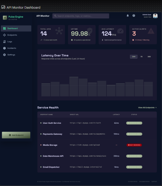
II. Hands-on Trial: Building the “PingSight” Dashboard in 15 Minutes
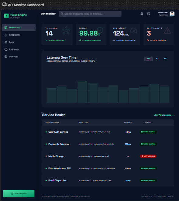
To test how “smart” Stitch really is when handling dense, complex data layouts, I decided to build an API Monitoring Dashboard featuring charts, data tables, and dynamic status badges.
Step 1: Ideation with the Initial Prompt
I started with a highly specific prompt on the blank canvas:
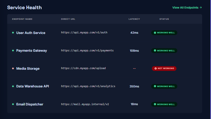
“Create a modern, dark mode web interface for monitoring API endpoints. The layout should include a left sidebar with navigation, a top header with an ‘Add Endpoint’ button. The main area should have four summary tabs (Total APIs, Uptime, Average Latency, Alerts), a location for a line graph showing latency, and a data table below listing the API name, URL, and status badge (Working Well in green, Not Working in red). Use a modern, technology-focused font and Tailwind CSS style.”
In just a few tens of seconds, Stitch returned a surprisingly solid layout. The spatial distribution was logical, the dark mode was easy on the eyes, and it clearly utilized standard Tailwind utility classes.
Step 2: Fine-tuning with the Smart Agent
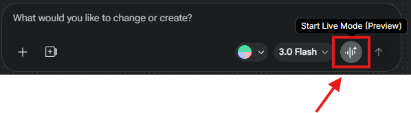
The initial design felt a bit too “static.” I wanted the status badges to look more tech-focused. I wanted to test the multimodal approach, specifically focusing on how Voice Input could handle macro-level layout and theme shifts, while the Chat Agent handled microscopic fine-tuning.
- Macro-level Shifts with Voice Input:
I clicked the microphone icon and spoke a command that completely inverted the theme and hierarchy of the design, which is always a tough test for context-aware AI:
“Hey Stitch, flip this entire dashboard to a clean light mode layout. And let’s move the summary cards below the chart for a different hierarchy.”
The Verdict: The agent understood the context flawlessly. In one fluid motion, the dashboard inverted its colors, and the summary cards repositioned themselves below the chart placeholder without breaking the surrounding layout or changing the components themselves. This made macro-level design changes feel incredibly fast and responsive.
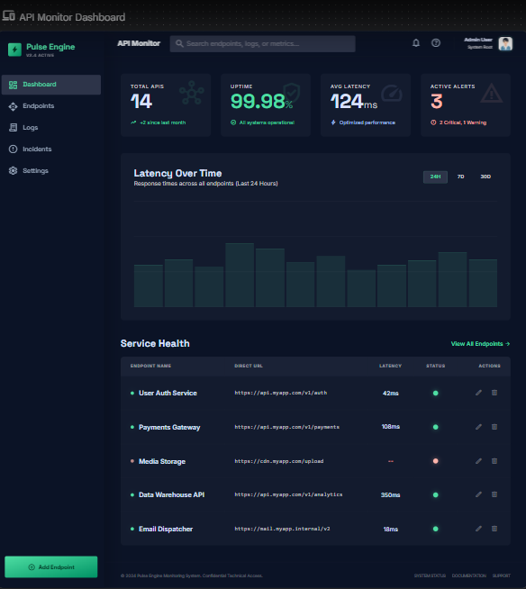
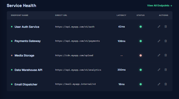
- Micro-level Fine-tuning with Chat Input:
“Change the design of the Status column in the table: Instead of text, change it to glowing dots in green, yellow, and red. Add an ‘Actions’ column with Edit and Delete icons.”
Stitch understood the context perfectly. It didn’t break the existing layout; it accurately isolated the Status column and applied the requested glowing dot effect.
The screen after fine-tuning:
And the result is exactly!
- Before:
- After:
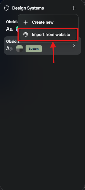
Step 3: “Import from Website” & DESIGN.md Mastery
Before moving on, I had to try Stitch’s most hyped feature: reverse-engineering a UI from a URL.
To really push its limits, I didn’t just use a standard website. I went to Modify → Design Systems and pasted the URL of a highly polished Dribbble shot: the Smart Energy Dashboard Concept by Bohdan Ratiiev for Zajno on Dribbble. I wanted to see if Stitch could capture that premium, neon-tech vibe.
Stitch instantly crawled the URL and extracted the core design elements—the deep atmospheric background colors, the sleek typography, the specific border-radius rules, and the accent spacing. It compiled all of this directly into a DESIGN.md file.
This is screen after changing DESIGN.md:
Here is why this is a killer feature for devs:
- Global Synchronization: This DESIGN.md isn’t just a static text file; it acts as the brain of your project.
- Live Editing: I manually edited the primary hex colors inside the DESIGN.md text editor and clicked Apply. Stitch immediately applied these new style rules across all my screens, maintaining absolute consistency without me having to select individual elements.
- Future-proofing: Any new screen I prompt in this project now automatically reads the DESIGN.md and uses the exact same format and style.
Step 4: Testing Instant Prototypes
I wanted to see if the AI grasped the business logic of the app. I clicked the “Add Endpoint” button and asked Stitch to generate the interaction.
Magically, it automatically created a Modal form overlay equipped with the right inputs (Name, URL) and even an HTTP Method dropdown (GET/POST) – perfectly matching API logic.
Video demo Prototype:
Step 5: From Design to React Components (The Direct Export Workflow)
While Stitch supports the MCP (Model Context Protocol) to pipe designs directly into your IDE, I opted for a more practical, highly controlled approach: Direct Export combined with an AI Agent in the IDE.
- First, I asked Stitch to export the design rules: “Extract the design system from this canvas and generate a DESIGN.md file. Ensure you specifically list the Hex color codes for the Status Badges: Healthy (Green), Down (Red), and Degraded (Yellow).”
- Next, I clicked the Code tab on Stitch to grab the raw, static HTML/Tailwind markup of the Dashboard.
- Finally, I dumped this static HTML and the DESIGN.md file into Cursor IDE (you can also use Claude Dev in VS Code) and prompted:“Here is the HTML/Tailwind code generated by Stitch and the DESIGN.md rules. Convert this static layout into modular React components. specifically, give me the code for StatusBadge.tsx and DataTable.tsx. Ensure the badge logic uses the hex colors from DESIGN.md.”
In under 2 minutes, I had clean, highly reusable React components in my codebase that adhered 100% to the color tokens from the original design.
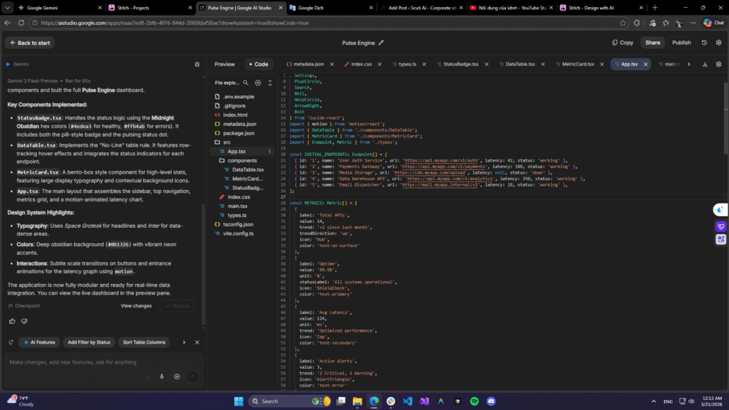
This is the example screen of code:
Video demo: https://youtu.be/VRNBWCxfnd4
III. An Objective Evaluation from a Developer’s POV
After messing around with it, here is my honest take on Google Stitch 2.0:
The Pros (+):
- Unmatched Ideation Speed: It completely cures “blank page syndrome.” Instead of spending hours arguing over wireframes, you instantly have a visual draft to discuss.
- The Perfect Design-to-Code Bridge: Unlike older AI tools that vomit inline CSS, Stitch uses clean Tailwind. The DESIGN.md file is a brilliant move—it allows IDE agents to understand your Design Tokens (colors, padding, fonts) so the generated code doesn’t stray from the visual standard.
The Cons (-):
- It’s Just UI, Not Logic: The generated code is, naturally, stateless. You still have to roll up your sleeves to wire up state management (Redux/Zustand), fetch real APIs, and handle complex business logic.
- Hard to Map to Massive Legacy Systems: If your company relies on a heavily customized, proprietary component library, forcing Stitch’s Tailwind-native code into that existing ecosystem will require some manual mapping effort.
IV. How to Apply Stitch to Your Daily Workflow
You shouldn’t (and couldn’t) use Stitch to replace your current Design team entirely. However, it is an incredible tool for bypassing specific bottlenecks:
- Building Internal Tools Fast: Admin panels and CMS dashboards rarely get dedicated design resources. Devs can now use Stitch to generate premium-looking UIs in minutes instead of relying on outdated Bootstrap templates.
- Rapid Prototyping in Client Meetings: Clients prefer seeing an app over hearing about it. Use Stitch’s Instant Prototypes to demo a clickable user flow right in the middle of a meeting to close the deal faster.
- Codebase Scaffolding: Use the workflow I demonstrated in Step 4 (Export HTML + DESIGN.md-> Cursor/IDE) to completely skip the tedious, mind-numbing process of slicing HTML and CSS.
Conclusion:
Google Stitch is genuinely a powerful sidekick that drastically shortens the gap between an idea and the first lines of UI code. While “Vibe Design” won’t write your backend logic for you, it will definitely save you from hours of fighting with Flexbox and Grid!
Have you guys tried the code export features of Stitch or hooked it up via MCP to your IDE yet? Let me know about your workflow in the comments below!
References & Resources:
Official Google Stitch Announcement: * Stitch by Google on X (Twitter)
Google Stitch Workspace: * stitch.withgoogle.com