Introduction
Nano Banana Pro brings high-quality image creation and editing into Gemini. This guide distills the seven official tips from Google’s blog into concise checklists and prompt recipes, with PNG placeholders ready for your own renders.
Browse the seven tips below, then use the conclusion as your quick action checklist before exporting.
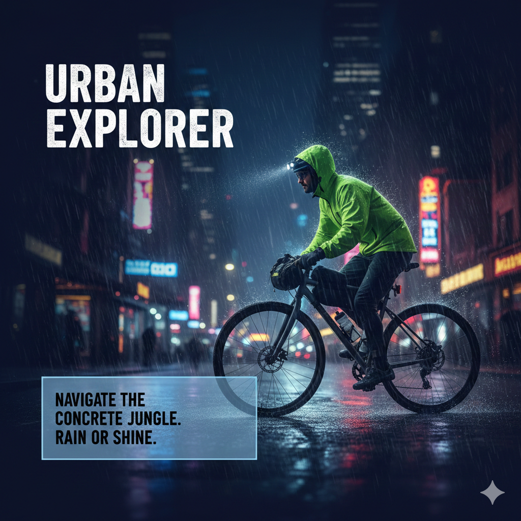
1) Generate visuals with incredible text rendering
Ask for sharp, readable text directly in the image. Define the exact words, font vibe, placement, contrast, and safe area so copy stays clean.
- Spell out the headline and subhead wording; choose a simple, high-contrast font style.
- Reserve a safe area for text; avoid busy backgrounds behind copy.
- Request kerning/spacing hints if needed (e.g., “tight letter spacing”).
- Keep paragraphs short; prefer bold, minimal lines for reliability.
Image prompt idea: “16:9 poster, deep blue background, headline ‘URBAN EXPLORER’ in bold white sans upper-left, subhead bottom-left on a translucent card, subject is a cyclist in neon city rain, crisp legible text.”
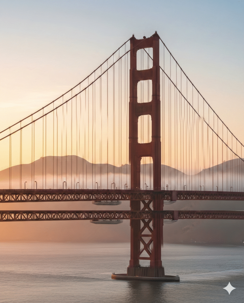
2) Create with real-world knowledge
Leverage Gemini 3 Pro’s grounding to produce accurate objects, places, and context-aware visuals.
- Reference real locations, materials, or era-specific details.
- State factual constraints (“accurate Victorian attire”, “correct bridge structure”).
- Use concise, precise nouns; avoid ambiguous slang.
- For products, note accurate proportions and materials.
Image prompt idea: “Photoreal 3/4 view of the Golden Gate Bridge at sunrise with accurate suspension details, light fog, warm rim light on cables, true proportions, 2K.”
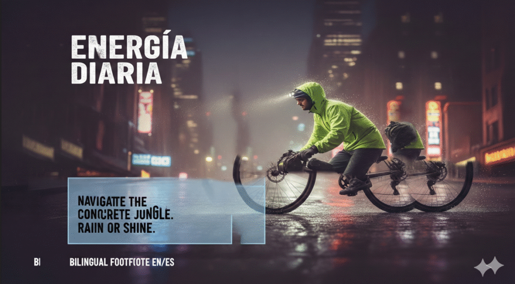
3) Translate and localize your ideas
Generate multilingual text inside images and adapt visuals for different regions.
- Specify target language and placement of localized text.
- Ask to preserve layout while swapping language.
- Keep copy short and high-contrast for legibility.
- Note cultural cues (colors, imagery) to adapt respectfully.
Image prompt idea: “Product poster 4:5, swap English headline to Spanish ‘Energía Diaria’, keep layout identical, add bilingual footnote EN/ES, warm daylight, clean sans-serif.”

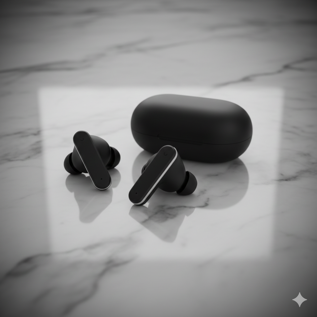
4) Use studio-quality control edits
Direct lighting, focus, and color grading like a pro instead of regenerating from scratch.
- Specify angle (top-down, low, 3/4), lens feel, and depth of field.
- Call out lighting (softbox, rim, golden hour, neon) and color grade.
- Refocus and relight before re-generating; tweak vignette or contrast lightly.
- Keep a consistent backdrop or surface for product sets.
Image prompt idea: “Studio packshot, matte black wireless earbuds on marble, 3/4 top-down, dual rim lights, shallow DOF, subtle vignette, neutral color grade, 2K.”
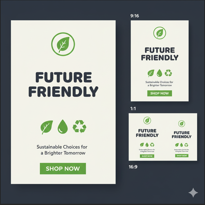
5) Resize with precision
Declare aspect ratios and target resolutions up front so outputs fit your channels.
- State ratio explicitly (1:1, 4:5, 16:9, 9:16) plus the pixel target (1K/2K/4K).
- Leave safe margins for text/logos; avoid edge crowding.
- Export multiple crops from the same scene to stay consistent across surfaces.
- Note where the focal point should sit for each crop.
Image prompt idea: “Trail runner poster, 4:5 at 2K, main subject lower third, large negative space top for headline; also request 1:1 and 16:9 variants from same scene.”
6) Blend images and keep multiple characters consistent
Combine several images or references while keeping character traits stable across the scene.
- Describe anchor traits (hair, outfit, colors, accessories) for each character.
- Assign reference roles if blending multiple inputs (pose, style, background).
- Ask for consistent lighting and scale across all subjects.
- For groups, note relative positions and interaction.
Image prompt idea: “Three friends on a city street, consistent faces/outfits: (1) short teal hair, yellow jacket; (2) curly brown hair, red scarf; (3) buzz cut, denim jacket. Golden-hour light, 3/4 view, natural proportions. Blend pose from image A, style from image B.”

7) Create and maintain your brand look and feel
Define your palette, typography vibe, icon shapes, and logo rules so every render aligns to brand.
- State brand colors and allowed accents; call out “no drop shadows” or other guardrails.
- Specify type style (rounded sans, geometric, serif) and weight.
- Note logo placement, clearspace, and safe areas.
- Keep illustration line weight or 3D material style consistent across surfaces.
Image prompt idea: “Eco brand hero, palette #22c55e and #0f172a on off-white, rounded sans headline, flat icons no shadows, logo top-left with clearspace, CTA solid green; also request 9:16 story and 16:9 banner versions.”
Strengths and current limitations
Strengths
- Sharper text rendering for posters, charts, and mockups.
- Grounded world knowledge via Gemini 3 Pro for factual scenes.
- Built-in multilingual/localization flow for on-image copy.
- Studio-style controls (angle, light, focus, grade) without re-prompts.
- High-res, flexible aspect ratios (1K/2K/4K) for multiple surfaces.
- Better character consistency and multi-image blending.
- Brand-style adherence across placements (web, social, print).
Current limitations
- Very small text and fine UI details may still blur—double-check exports.
- Factual/data visuals (charts, maps) need manual verification.
- Localization can miss nuances; review grammar and context.
- Complex blends or heavy edits can introduce artifacts—iterate lightly.
- Character fidelity may drift across extreme poses or lighting shifts.
Conclusion
After applying all seven tips, you should see cleaner text, more faithful details, smoother localization, studio-like control, better-fit aspect/rez, consistent characters, and a cohesive brand look. Give them a try in one session to feel the difference end-to-end.
Source: Google blog